
Why modern resume layouts matter now
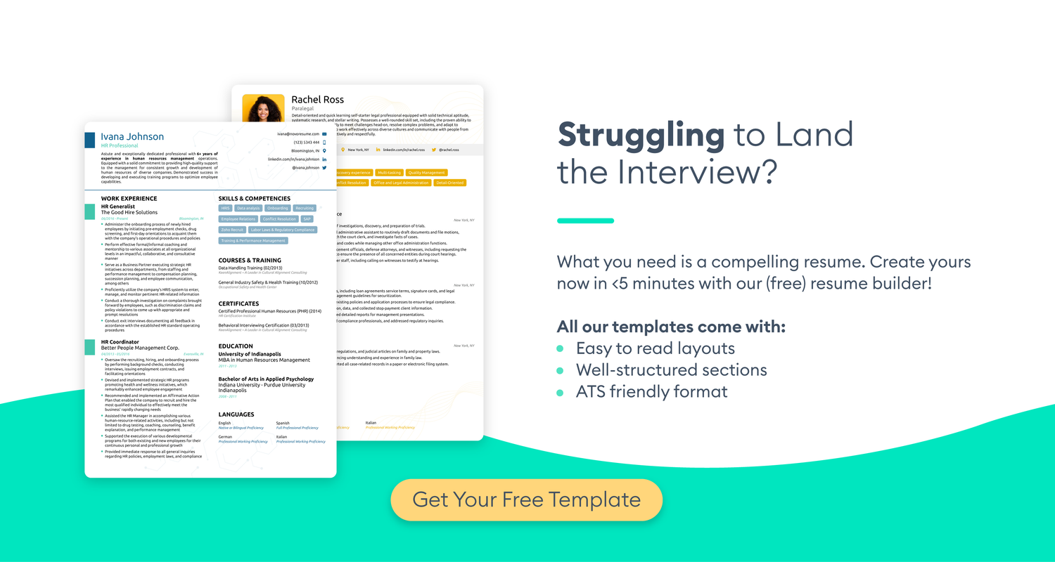
A modern resume layout is a technical document designed for two distinct readers: the applicant tracking system (ATS) and the hiring manager. "Modern" in this context means a clean, structured design that prioritizes readability for software parsing while maintaining enough visual hierarchy to engage a human recruiter who spends only seconds scanning the page.
According to Indeed, a modern resume template typically features a clean layout with subtle design elements, sleek fonts, and smart use of white space. This approach avoids the dense, cluttered blocks of text that often confuse ATS parsers, ensuring your experience is categorized correctly before a human ever sees it. The goal is to balance aesthetic simplicity with technical precision.

Skipping complex columns, graphics, or unusual fonts is not a limitation—it is a strategic choice. By adhering to standard formatting, you ensure that your keywords and job titles are indexed correctly. This technical compatibility is the foundation upon which your personal brand is built; without it, even the most compelling content remains invisible to the tools that filter the majority of applications.
Clean single-column layouts
A single-column layout remains the most reliable choice for modern resumes, particularly when applying through automated tracking systems. By stacking content vertically, this structure ensures that Applicant Tracking Systems (ATS) can parse your work history, education, and skills without error. Complex two-column designs or sidebars often confuse these parsers, potentially scrambling your data or dropping entire sections.
Beyond technical compatibility, the single-column format offers superior readability for human recruiters. The eye naturally flows from top to bottom, allowing hiring managers to scan your achievements quickly without losing their place. This linear approach forces you to prioritize the most relevant information at the top, rather than burying it in a sidebar.
To maintain a modern aesthetic without relying on columns, use subtle design elements like sleek fonts and strategic white space. Keep margins consistent and use bold text for section headers to create visual hierarchy. This approach creates a clean, professional appearance that signals attention to detail.

Two-column designs for visual impact
Two-column layouts separate content into distinct zones, typically using a narrower left sidebar for contact details, skills, and education while reserving the wider right column for professional experience. This structure allows recruiters to scan your core competencies quickly without wading through dense paragraphs of job descriptions. It is a popular choice for creative roles or career changers who need to highlight transferable skills alongside their work history.
However, this format comes with significant technical risks. Many Applicant Tracking Systems (ATS) parse resumes linearly, reading left-to-right. If a two-column layout uses complex tables or text boxes, the software may jumble the content, resulting in a garbled resume that fails to rank. According to industry data, a significant portion of modern resumes are rejected by automated systems before a human ever sees them, making layout compatibility a critical factor in your job search strategy.
To mitigate these risks, ensure your two-column design is built using simple columns rather than tables or text boxes. This allows the ATS to read the content in a logical order while preserving the visual distinction for the human recruiter. If you are applying to large corporations or highly regulated industries, a single-column layout remains the safest bet for maximum compatibility, whereas two-column designs work best for industries where visual presentation is valued, such as marketing, design, or tech startups.
| Feature | Single-Column | Two-Column |
|---|---|---|
| ATS Compatibility | High | Medium |
| Visual Appeal | Standard | High |
| Space Efficiency | Low | High |
| Best For | Corporate/Traditional | Creative/Tech |
Typography and color choices
The fonts you choose act as the visual structure of your resume, guiding the recruiter’s eye through your experience without distraction. A modern resume relies on clean, sans-serif typefaces like Calibri, Arial, or Helvetica, which render clearly on both screens and paper. These fonts project efficiency and readability, ensuring that your content remains the focal point rather than the design itself.
Pair your primary font with a secondary typeface for headers to create a clear visual hierarchy. This distinction helps recruiters quickly locate sections like "Experience" or "Skills." Avoid decorative or script fonts, which can appear unprofessional and often fail to parse correctly in Applicant Tracking Systems (ATS). As noted by Indeed, a modern template typically features sleek fonts and smart use of white space to maintain a clean layout Indeed.
Color should be used sparingly as an accent rather than a dominant feature. A single shade of navy blue for headers or bullet points adds a touch of personality while maintaining a professional tone. Avoid bright reds or neon colors, which can strain the eyes or suggest a lack of seriousness. Subtle accents signal attention to detail without compromising the ATS-friendly nature of your document.

ATS-friendly resume optimization
Modern design elements like columns, graphics, and custom fonts often break Applicant Tracking Systems (ATS). These automated parsers struggle to read complex layouts, potentially filtering out qualified candidates before a human ever sees the document. To ensure your resume gets through, you must balance visual appeal with machine readability.
The safest approach is to stick to standard, single-column formatting for the core content. Avoid text boxes, headers, footers, and tables, as ATS software frequently skips these elements or reads them out of order. Use standard section headings like "Experience" and "Education" rather than creative titles like "My Journey," which parsers may not recognize.
When incorporating design, limit it to simple bullet points and standard fonts like Arial, Calibri, or Times New Roman. If you include a sidebar for skills or contact info, ensure it is part of the main document flow, not a separate text box. This keeps the parser’s reading order logical and intact.

To verify your resume’s compatibility, test it with free ATS simulators. Upload your file to tools like Jobscan or Resume Worded to see how the system parses your content. These tools highlight missing keywords and formatting errors, allowing you to fix issues before applying. This step is essential for ensuring your modern design doesn’t become a barrier to entry.
Frequently asked: what to check next
What are the 5 P's of a resume?
The 5 P's framework helps ensure your resume is effective: Presentation, Personalization, Precision, Performance, and Professionalism. Presentation refers to the visual layout—clean fonts, consistent spacing, and logical hierarchy. Personalization means tailoring the content to the specific job description. Precision involves using exact metrics (e.g., "increased sales by 20%") rather than vague statements. Performance highlights your actual results, and Professionalism covers tone, grammar, and adherence to industry norms.
What is the best resume template for modern job applications?
A single-column, reverse-chronological template is the most reliable choice for modern job applications. This format is ATS-friendly and easy for recruiters to scan. Avoid complex two-column layouts, graphics, or tables, as these often confuse applicant tracking systems. Stick to standard sections like "Experience," "Education," and "Skills" with clear headings. Use a simple font like Arial or Calibri at 10-12 point size for optimal readability.
How do I optimize my resume for ATS systems?
To optimize for Applicant Tracking Systems (ATS), use standard section headings and avoid headers/footers where contact information might be missed. Include keywords from the job description naturally within your bullet points. Save your resume as a .docx or .pdf file unless otherwise specified. Avoid using images, charts, or special characters that the system cannot parse. Test your resume by copying and pasting the text into a plain text editor to see if the structure remains intact.
How many pages should a modern resume be?
For most professionals, a one-page resume is ideal, especially if you have under 10 years of experience. It forces you to prioritize the most relevant achievements and keeps the recruiter’s attention. If you have extensive experience (10+ years) or are in academia, a two-page resume may be acceptable. However, never exceed two pages unless specifically requested. Every line should add value; if it doesn’t support your candidacy, remove it.
What is the difference between a resume and a CV?
A resume is a concise, targeted summary of your skills and experience, typically one to two pages, used in industry job applications. A Curriculum Vitae (CV) is a comprehensive document detailing your entire academic and professional history, including publications, grants, and conferences, and can be many pages long. CVs are primarily used in academia, medicine, and research roles. In most corporate or private sector jobs, you will submit a resume, not a CV.
No comments yet. Be the first to share your thoughts!