
The Resume Reset: Why 2024 Demands a New Look
The 2024 job market is crowded. A resume that worked eighteen months ago often fails now because screening software and recruiter expectations have shifted. You need a document that satisfies both automated filters and the person behind the screen.
We’re seeing a bigger push for Applicant Tracking System (ATS) optimization, but that doesn't mean sacrificing readability. Recruiters are incredibly busy, often spending just seconds on that first scan. Your resume needs to make an immediate impact, both for the robots and the humans. A dated format can signal to a recruiter that you’re not keeping up with industry standards.
ATS Still Rules, But Humans Are Reading (Eventually)
Applicant Tracking Systems are the gatekeepers of many job applications. These systems scan your resume for keywords, parse the information into their database, and then rank candidates based on how well they match the job description. They're looking for specific skills, experience levels, and even formatting elements.
But don’t fall into the trap of thinking your resume is only for the machine. Even if you ace the ATS, a real person will eventually review your resume. That’s where design and clarity come into play. A resume that's optimized for keywords but looks like it was thrown together in a hurry won't inspire confidence.
The key is balance. You need to incorporate relevant keywords naturally into your resume, without making it sound robotic or keyword-stuffed. According to resources at hr.ucdavis.edu, understanding the different resume formats is a good start, but tailoring it to both the system and the reader is what gets you the interview. Think about how a recruiter’s eye will flow across the page. A well-designed resume shows you pay attention to detail and take pride in your work.
- Keyword Research: Identify the skills and terms used in the job descriptions you're targeting.
- ATS-Friendly Formatting: Use standard fonts, clear headings, and avoid tables or graphics that might confuse the system.
- Human-Readable Design: Prioritize clarity, white space, and a professional aesthetic.
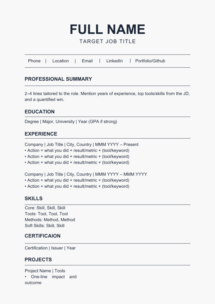
Layout #1: The Chronological Classic – Reimagined
The chronological resume format is the most traditional, listing your work experience in reverse chronological order. It’s familiar to recruiters and easy to follow, which are definite pluses. However, it can also highlight employment gaps or downplay transferable skills if your experience isn't directly related to the job you're applying for.
But don’t write it off! The chronological format can be modernized with subtle design choices. A clean, professional font like Calibri or Arial, combined with strategic use of white space, can make a big difference. Adding a concise professional summary at the top can quickly highlight your key qualifications.
Use quantifiable achievements. Instead of 'Managed a team,' use 'Led a team of 5 to exceed sales targets by 15% in Q2 2023.' Specificity wins over vague descriptions.
Layouts #2 & #3: Functional & Combination – For Career Changers & Gappers
If you’re changing careers or have gaps in your employment history, the functional or combination resume format might be a good fit. A functional resume emphasizes your skills rather than your work experience, making it ideal for highlighting transferable abilities. A combination resume blends both skills and experience, giving you more flexibility.
However, be warned: some employers are wary of functional resumes. They may suspect you're trying to hide something. To address this concern, clearly showcase your skills and then provide a brief work history section listing your employers and dates of employment. A skills matrix – a table listing your skills and proficiency levels – can be a helpful addition.
The combination resume is often a safer bet. It allows you to highlight your skills while still providing a clear timeline of your work experience. This format is particularly effective if you have a diverse background and want to emphasize your adaptability. Be honest and transparent about your experience, even if it’s not perfectly aligned with the job description.
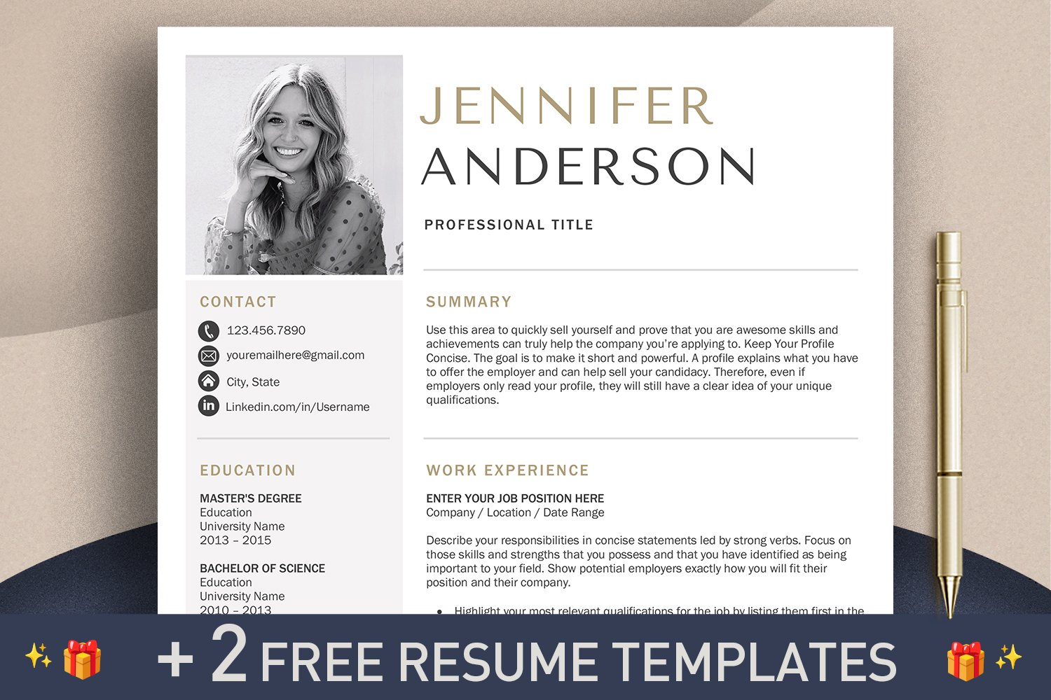
Layouts #4, #5 & #6: The Skill-Based & Infographic Resumes – When to Be Bold
For creative fields like graphic design, marketing, or web development, a skill-based or infographic resume can really make you stand out. These formats prioritize visual appeal and allow you to showcase your work in a more engaging way. A skill-based resume is similar to a functional resume, but with a stronger visual component.
Infographic resumes use charts, graphs, and icons to present information in a visually compelling manner. However, these formats aren’t appropriate for all industries. Conservative fields like finance or law typically prefer a more traditional approach. Before using a creative layout, research the company and industry culture.
Readability is crucial. Avoid clutter and ensure that your skills and experience are easy to find. Review modern layouts to see how others handle white space. Remember, the goal is to showcase your creativity and demonstrate your professionalism. A visually stunning resume that’s difficult to read will do more harm than good.
- Skill-Based: Emphasizes skills with visual elements.
- Infographic: Uses charts and graphics to present information.
- Best for: Creative roles where visual communication is key.
Top Resume Layouts for 2024
- Modern Simplicity - Clean lines and a focus on readability make this template ideal for professionals in any field. It emphasizes skills and experience without unnecessary clutter. Preview & Use
- Creative Flow - This template utilizes a two-column layout with a subtle color accent, making it a great choice for those in marketing, design, or communications roles. Preview & Use
- Executive Ascent - Designed for leadership positions, this template highlights accomplishments and career progression with a sophisticated, professional aesthetic. Preview & Use
- Tech Innovator - A visually appealing template suited for tech professionals (engineers, developers, data scientists). It features sections to showcase technical skills and projects. Preview & Use
- Healthcare Harmony - This template is tailored for healthcare professionals (nurses, medical assistants, therapists). It balances professionalism with a compassionate tone. Preview & Use
- Academic Excellence - Ideal for academics, researchers, and educators. This template provides ample space to list publications, presentations, and teaching experience. Preview & Use
- Dynamic Edge - A bold and modern template that uses color blocking and a unique layout to grab attention. Suitable for creative roles and those seeking to make a strong first impression. Preview & Use
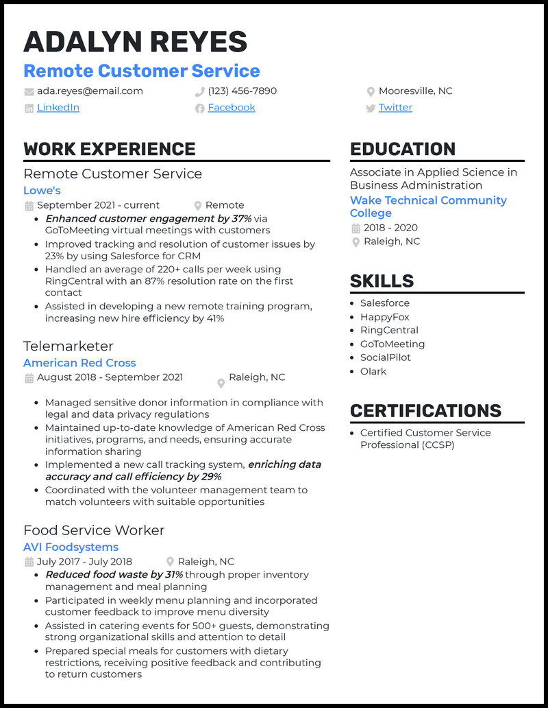
Layout #7: The Two-Column – Maximizing Space and Impact
The two-column layout is a great way to maximize space and present a lot of information concisely. Typically, one column is used for skills and keywords, while the other is used for work experience. This allows recruiters to quickly scan your qualifications and identify relevant skills.
Effective use of white space is essential in a two-column layout. Avoid overcrowding the columns with text. Use clear headings and bullet points to break up information and make it easy to read. This layout works particularly well for those with a lot of experience or a diverse skill set.
A poorly designed two-column layout can feel cramped and overwhelming. Ensure there’s a clear visual hierarchy, guiding the reader’s eye through the information. Balance the amount of text in each column to create a visually appealing and balanced design.
Beyond Layout: Essential Design Principles for 2024
Choosing a layout is just the first step. In 2024, attention to design details is more important than ever. Typography plays a huge role. Opt for professional fonts like Arial, Calibri, or Times New Roman, and use consistent font sizes and spacing. Avoid overly decorative fonts that can be difficult to read.
Stick to neutral colors like black and slate gray with one accent color. White space creates breathing room. Use headings and bolding to guide the reader to your most impressive wins.
Consistency is key. Use the same formatting throughout your resume. A consistent design demonstrates attention to detail and professionalism. Dump CV’s editing tools can help you maintain consistency and ensure your resume looks polished and professional. Remember, design isn’t just about aesthetics; it’s about usability and clarity.
Testing Your Resume: Before You Hit ‘Apply’
Before you submit your resume, proofread it – multiple times! Errors can create a negative impression and signal a lack of attention to detail. Use online grammar checkers like Grammarly to catch any mistakes you might have missed. Spelling and grammar errors are an easy way for a recruiter to dismiss your application.
Get feedback from friends, mentors, or career counselors. A fresh pair of eyes can often spot errors or areas for improvement that you might have overlooked. If possible, test your resume with an ATS simulator. While free options are often limited, they can give you a general idea of how well your resume will perform.
Finally, remember to tailor your resume to each job application. Highlight the skills and experience that are most relevant to the specific position. Don’t just send out a generic resume – take the time to customize it to each opportunity. Utilize Dump CV’s resume optimization tools to help ensure your resume is tailored and effective.

No comments yet. Be the first to share your thoughts!